Because I am not a overly-talented person in the arts of, well, anything, I decided to offer a little bit of critique and analysis of the website for The Desert Rat and possibly begin to build a simple version of something I believe could be more effective.
My first impression of the website is, unsurprisingly, borderline impressed. For a small local business, the creativity fostered in the background of each page is impressive. However, although the site sticks to the overall style guide of font and color, I think it would be more effective for the background to possess a more "desert-y" color, such as a sand color, or an actual picture of the area taken by a customer, with it possibly rotating through on a weekly basis. I think the white background contradicts the rest of the desert theme of the style.
The site also does a respectable job of drawing in the attention to the top left of the screen, with the Desert Rate logo beginning the process of guiding one's eye in the Z pattern. What I do not like is that there is not a lot of things to draw attention to and the pages are very bland. Because the site is not an online store, it doesn't necessarily need to have a ton of things, but some more info and a few more graphic elements, such as photos or videos, would be great additions. Using the rule of the and various layout designs for each page, the site could remain very simple while also providing necessary information.
I have begun building a website using wix.com with a basic idea of something I have in mind. (It is nowhere near complete).
Monday, July 7, 2014
Group project personas and communication objectives
Target Market
Becca, 16,
is a junior at Snow Canyon High School who loves spending time with her
friends. She recently received her driver’s license and has been yearning to go
and have adventures. Her parents encourage her to try new things and stay fit
and active. Becca loves boating with her family, but loves to spend time
outdoors with her friends. She is involved in multiple clubs at school.
Rob, 28, and Susan, 26, is a young married couple with a 1-year-old baby
boy. Rob works construction with his father-in-law while Susan stays home to
take care of their son. Prior to getting
married, the couple enjoyed traveling together and spending a lot of time
planning out vacations. They recently started going on “date nights” once a week while Susan’s sister watched
the baby. They are looking to find new things to do as a couple to combat the monotonous
routine of dinner and a movie or mini golf.
Richard, 59, and Donna, 57, have been married for 35 years and
empty-nesters for six years. Richard is a cardiologist and is only a couple of
years away from retirement. Donna volunteers at the hospital three days a week
to keep busy while her husband is at work. Donna loves to crochet and Richard
enjoys working in the garage and golfing with his buddies from work. Both are
looking for new hobbies that will keep them active and spend time
together.
Communication
Objectives
To greater establish the name of Desert Rat to a wider market, outside
of those who are high-level adventurers.
Update and expand mediums through which current advertising is done.
Inspire the people of the St. George area, and its visitors, to be more outgoing
and try something new through multiple methods of visual communication.
Wednesday, June 25, 2014
Mis-en-Scene
The Dark Knight-The Hospital Scene
Wally Pfister, Director of Photography
Filmography:
- The Dark Knight Rises
- Batman Begins
- Inception
- The Prestige
- Moneyball
- The Italian Job
For the hospital scene in "The Dark Knight", Pfister implemented the use of multiple IMAX cameras, including one on a crane, which tracked Heath Ledger as he walked out of the hospital and into a bus before the camera zoomed out to a wider angle to include the image of the hospital exploding. That part of the scene only took one shot. The use of IMAX cameras caused a more dramatic effect on the audience. Both Nolan and Pfister said they wanted the audience to feel a sense of insecurity, like anything could happen and nothing was impossible with the Joker.
Update: The scene was originally not going to include the image of the hospital exploding and collapsing, but Nolan, Pfister and Co. decided they needed it in order to have the desired effect on the audience.
Tuesday, June 24, 2014
Compose your frame
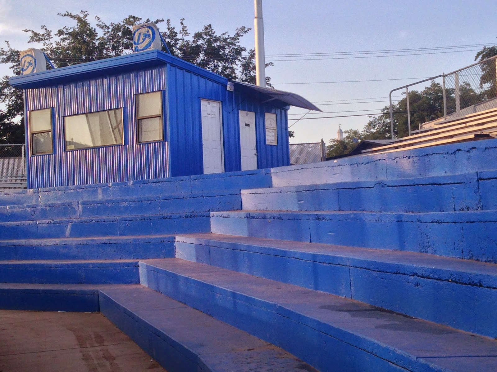
I took this photo at Dixie High School as I was walking near my friend's house. I borrowed his iPhone 5 to take this shot. I tried to make the shed the subject of this photo and place it in the upper left third. Although I like the diagonal lines of the stairs leading the eye to the shed, I feel like this would be better if there was a little more contrast in the photo. I like the blue power, but there could be improvements to this, which is why I am no photographer.
Axioms of Web Design
For this assignment I chose to evaluate ESPN.com. This is a site that I visit several times a day, and not just for the obvious reason that I love sports. The design of the site, especially the home page, is extremely simple, yet, very pleasing to the eye. The placement of the company logo is is second only to the placement of top story media in the left center of the page. This is a natural spot for viewers to place their immediate attention. From there, other top stories are neatly organized below with corresponding media. To the right are links to top stories. Above this is the customizable navigation bar, with current scores above. My favorite thing about the site is it doesn't allow much scrolling. I'm a very big fan of a deep site with lots of links with visual aides, as I'm sure most sports fans are.
I think ESPN is one of the top companies in the world in maintaining its strong brand, and its consistent website attracts millions of hits per day for a reason; the organizational pattern it follows is outstanding.
I think ESPN is one of the top companies in the world in maintaining its strong brand, and its consistent website attracts millions of hits per day for a reason; the organizational pattern it follows is outstanding.
Thursday, June 5, 2014
Balance, Harmony, Contrast
This photo is mainly about Harmony to me, with the meaning behind it being the most important element to me. I served an LDS mission to the Rio Grande Valley in Texas, not a place known for many beautiful things, other than its sunsets. This area is subject to a lot of drug cartel related violence, along with illegal immigrant controversy and other issues. It is also extremely hot and humid for many months of the year. Most days were physically a literal living hell. However, at the end of almost every day, the sun would set on the horizon and provide amazingly stunning and peaceful sunsets, of which I had never seen the likes of.
I love the contrast in this photo of the Rio Grande and the sky above it. The texture of the ripples in the water and the clouds in the sky truly give this a peaceful tone, not the violent one you might experience while watching an episode of "Border Wars." I think the balance of land, water, and sky allows a very appealing and powerful effect.

I love the contrast in this photo of the Rio Grande and the sky above it. The texture of the ripples in the water and the clouds in the sky truly give this a peaceful tone, not the violent one you might experience while watching an episode of "Border Wars." I think the balance of land, water, and sky allows a very appealing and powerful effect.
Design Evaluation
For my design evaluation, I decided to compare car advertisements found in ESPN The Magazine. To me, it is very clear which one is better.
The Bad
In my opinion, this advertisement for Kia is very poor in quality of design. One element that particularly bothers me is the the attire worn by the model. I understand that football and futbol are different, but WTF does the American football equipment have to do with anything?
The overall continuity of the ad throws me off as well. It took me about 30 seconds to figure out that this was one single ad, not two ads on adjacent pages. One reason this happened is because the athlete is kicking the ball in the wrong direction, drawing my attention off the page and away from the product on the opposite page. While attempting to be simple, this ad has become complicated.
There also is a bit of closure lacking; I can not tell if the is in the middle of the field or close to goal, and I also do not know if the cars are supposed to be near the stadium or not.

The Good
This ad for Jaguar is really appealing to me. Because this is the World Cup issue, Jaguar also goes with a soccer theme, just like Kia. The difference? This one makes sense and actually advertises the product. The natural lines of the car leave a direct path to follow toward the city, the stadium, and the Christ statue.
The foreground/background relationship is marvelous, and makes both the car and Brazil very sexy. The contrast is very well done and the design of the text goes very well with the brand that Jaguar has established.

The Bad
In my opinion, this advertisement for Kia is very poor in quality of design. One element that particularly bothers me is the the attire worn by the model. I understand that football and futbol are different, but WTF does the American football equipment have to do with anything?
The overall continuity of the ad throws me off as well. It took me about 30 seconds to figure out that this was one single ad, not two ads on adjacent pages. One reason this happened is because the athlete is kicking the ball in the wrong direction, drawing my attention off the page and away from the product on the opposite page. While attempting to be simple, this ad has become complicated.
There also is a bit of closure lacking; I can not tell if the is in the middle of the field or close to goal, and I also do not know if the cars are supposed to be near the stadium or not.
The Good
This ad for Jaguar is really appealing to me. Because this is the World Cup issue, Jaguar also goes with a soccer theme, just like Kia. The difference? This one makes sense and actually advertises the product. The natural lines of the car leave a direct path to follow toward the city, the stadium, and the Christ statue.
The foreground/background relationship is marvelous, and makes both the car and Brazil very sexy. The contrast is very well done and the design of the text goes very well with the brand that Jaguar has established.
Subscribe to:
Posts (Atom)